Your wedding color palette is far more than just an aesthetic preference; it’s the guiding thread that will weave together every detail, from stationery to florals, outfits to lighting, creating a coherent and memorable atmosphere. It’s the visual soul of your big day, the vibrant essence that will resonate with your guests and etch memories into their hearts. As a wedding professional, we see color as the primary language of your celebration. But how do you navigate this infinite spectrum of shades without tearing your hair out? Follow our expert guide to a serene selection process.
Why the Color Palette is Crucial
Before diving into the tips, let’s understand why this choice is fundamental:
- The Atmosphere: Colors possess immense emotional power. They can evoke joy, serenity, passion, mystery, or grandeur. They define the overall mood of your wedding.
- Visual Cohesion: A well-defined palette ensures harmony among all elements, preventing visual chaos and creating a sense of unity and professionalism.
- Cherished Photos: Your wedding photos will be sublimated by a thoughtful palette, enhancing the details and emotions of every moment.
The Absolutely Essential Elements to Consider

For a wise choice, leave nothing to chance. Think about these key points:
- The Venue: Your Starting Point
- Existing Colors: Observe the permanent colors of the venue: walls, floors, woodwork, drapes, gardens. A hall with antique parquet, exposed stone, a blooming summer garden, or a modern, minimalist interior… each has its own personality. Don’t fight the venue; work with it!
- Architectural Style: A medieval castle might call for deeper, regal hues, while a contemporary villa on the French Riviera will harmonize with fresh, bright colors.
- The Season: Nature as Your Companion
- Spring: Pastel shades, soft greens, gentle yellows, lavender, sky blues.
- Summer: Bright and vibrant colors: coral, turquoise, fuchsia, sunny yellows. Or softer, natural tones for a “beachside” feel.
- Autumn: Rich, warm tones: burgundy, rust, gold, forest green, warm browns, burnt orange.
- Winter: Silver, gold, pure white, icy blue, forest green, deep red, plum. The contrast with snow or the warmth of a fireplace can be an inspiration.
- Your Personality and Your Story: Authenticity Above All
- Your Favorite Colors: What colors speak to you, what colors represent you as a couple?
- Your Lifestyle: Are you more bohemian, classic, modern, adventurous? Your palette should reflect your identity.
- A Shared Memory: A color linked to your first meeting, a trip, a symbolic object… These details can give unique depth to your palette.
Our Expert Tips for a Successful Palette

Color choice is an art, but it relies on simple principles that we apply for you :
- The 60-30-10 Rule (or the Art of Proportion):
- 60% Dominant Color: This is the main, most prevalent color. It will appear on tablecloths, large floral arrangements, main lighting, walls.
- 30% Secondary Color: This complements the dominant color, creating contrast or harmony. You’ll find it in napkins, certain stationery elements, floral accents, seating.
- 10% Accent Color: This is the vibrant touch, the little spark that awakens the whole. Think of the groom’s boutonnière, a ribbon on the bouquet, a detail in stationery, candles, or dinnerware.
- Example: If your theme is “Rustic Elegance,” you might have 60% Sage Green, 30% Off-White, and 10% Gold accents.
- Start with a Neutral Base (Your Backdrop):
- White, cream, gray, beige, or taupe are excellent foundations. They bring light, elegance, and allow accent colors to shine without overwhelming.
- These neutral colors are the perfect canvas for your pops of color and offer maximum flexibility if you change your mind about a detail.
- Use the Color Wheel (The Science of Colors):
- Complementary Colors: Opposites on the wheel (e.g., blue and orange). They create a strong, dynamic contrast, ideal for a “Wow” effect. Use them wisely to avoid visual fatigue.
- Analogous Colors: Neighbors on the wheel (e.g., blue, green, purple). They offer a soft, natural harmony, perfect for a serene and fluid ambiance.
- Monochromatic Colors: Different shades of the same color. For subtle, sophisticated, and very refined elegance. Think of gradients of gray or blue, for instance.
- Consider Textures and Materials (The Touch of Color):
- Color isn’t just a hue; it’s also a texture. Burgundy velvet won’t have the same impact as burgundy silk. Raw wood brings a warmth that metal cannot.
- Mix materials (linen, lace, wood, metal, glass) to add depth, dimension, and character to your decor, even with a limited palette.
- Don’t Be Afraid of a Metallic Touch (The Sparkle of Luxury):
- Gold, silver, bronze, or rose gold can elevate any palette and add a touch of luxury and sparkle. Use them sparingly as an accent color in dinnerware, candles, mirrors, or floral ornaments for a “jewel” effect.
- The Lighting Test (The Mood Revelator):
- A color reacts differently under natural light (day, sunset) and artificial light (candles, spotlights).
- If possible, test your color samples under the venue’s lighting conditions, at different times of day. This will help you avoid surprises and ensure you achieve the desired ambiance.
- Create a Detailed Mood Board (Your Visual Treasure Map):
- Beyond a simple list of colors, create a physical or digital mood board (on Pinterest or Canva).
- Collect images of flowers, fabrics, dinnerware, stationery, furniture, and even dresses, within your chosen palette. This will allow you to visualize the overall harmony and validate your choices before committing. It’s your visual guide for all vendors.
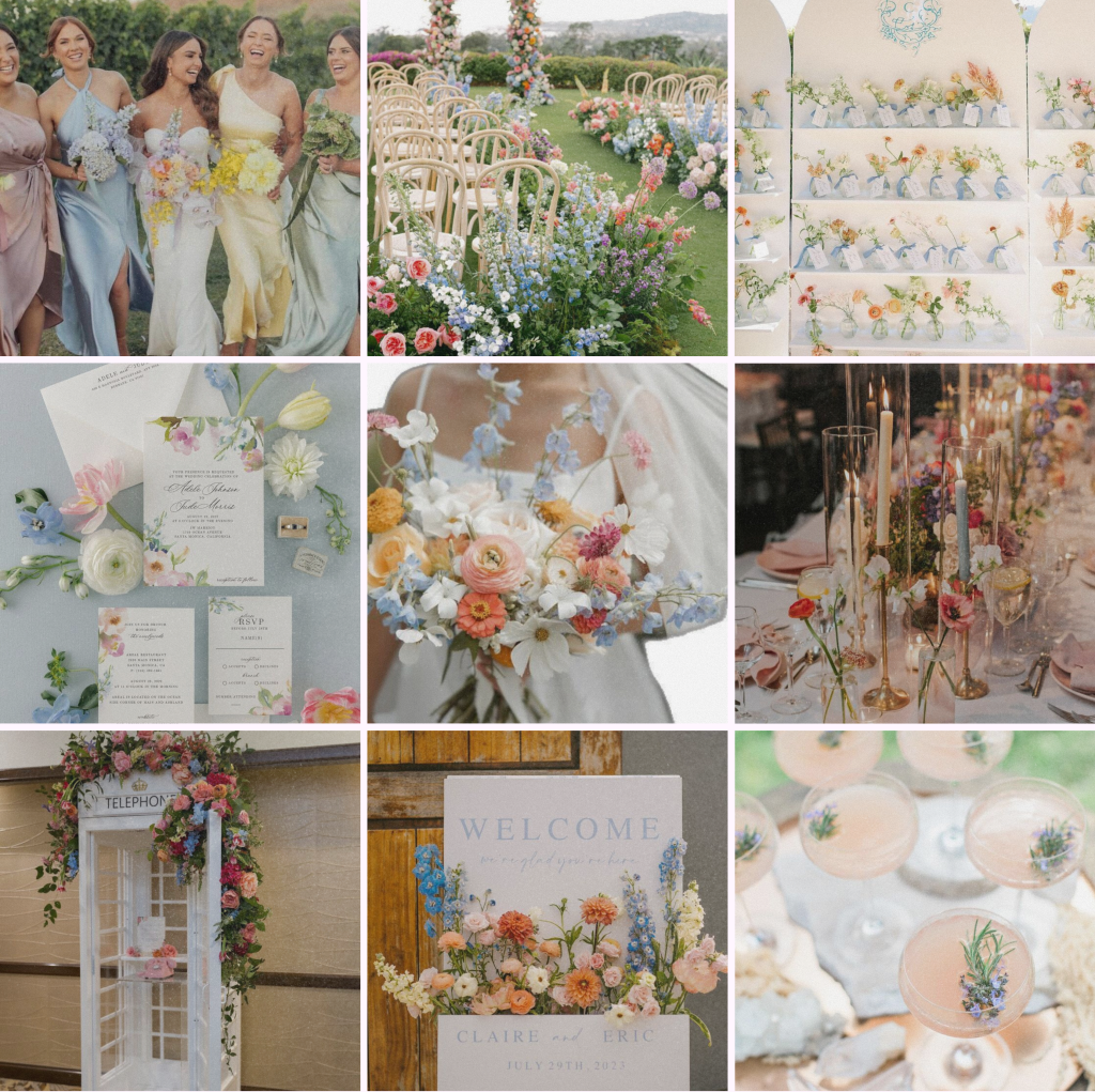
Example Palettes to Inspire You
To help you visualize these ambiances, here are the exact color codes you can use to find images or create your own inspiration boards:
“Secret Garden” Palette

“Something Blue” Palette

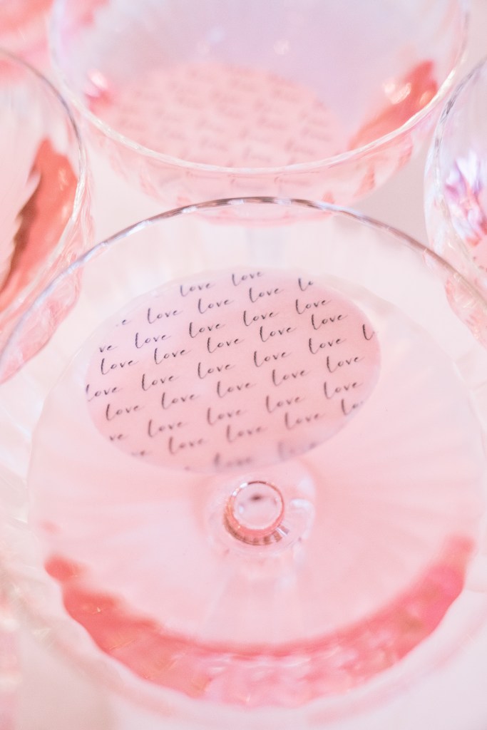
“Pink Era” Palette

Choosing your color palette is an exciting step, where the soul of your wedding begins to take shape. It’s a reflection of your story, your personality, and the ambiance you wish to create. At Amarande Events, we are here to guide you through this creative process, ensuring that every shade contributes to making your big day a perfectly harmonious and unforgettable work of art.
Ready to color your love?
Credits photos : Brice Lauer
*All the moodboards were drawn up by Amarande Events and pictures to do them were found on pinterest


Leave a comment